
Can a Customer Finish Your Enquiry Form Without a Mouse? A Practical Accessibility Check
A hands-on checklist for keyboard, screen-reader and mobile use: clear field labels, useful error messages, visible focus and a shorter enquiry journey.
UniqueTechCamp Editorial
Digital Services Team • UniqueTechCamp Engineering Unit
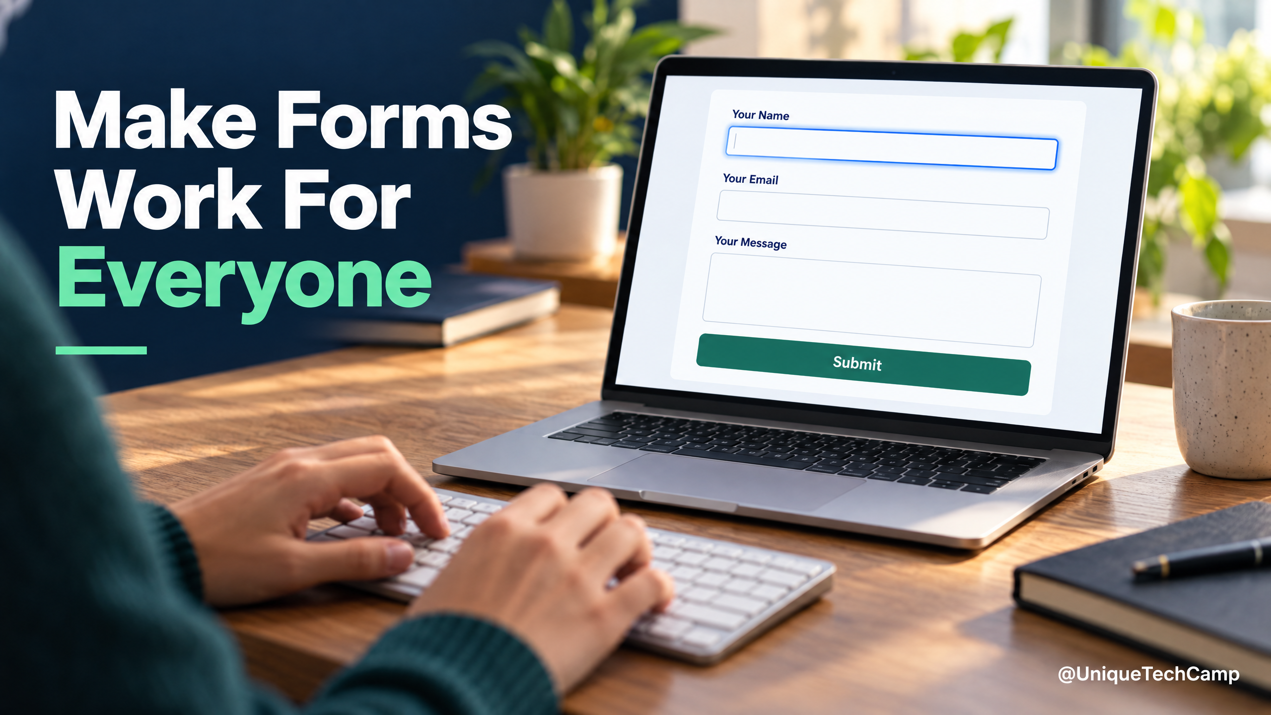
A contact form can look polished and still block a real enquiry. A placeholder that vanishes when someone starts typing, a tiny checkbox, or an error that only changes a field’s colour can leave a visitor unsure what to do next. The practical test is simple: can a person understand the form, complete it with the way they use the web, and tell whether it worked?
The W3C Web Accessibility Initiative’s Forms Tutorial recommends keeping forms simple and asking only for information needed to complete the task. Its guidance covers labels, instructions, validation, notifications and multi-page forms. The WCAG 2.2 Recommendation includes success criteria for labels and instructions, error identification, keyboard use, focus and target size. The standard is a technical reference; which accessibility rules legally apply to a particular organisation depends on its jurisdiction, sector and contracts.
Start with labels people can find
Give every input a visible, programmatically associated label: “Work email,” not just an example inside the empty box. A placeholder can illustrate a format, but should not replace the label. Mark required fields in text as well as visually, and explain formats before submission—for example, whether a phone number should include a country code. For groups of radio buttons or checkboxes, provide a clear group name so each choice makes sense in context. See W3C’s form-label guidance.
Check the route through the form using only a keyboard
Put focus in the first field and use Tab and Shift+Tab to move through the page. The order should follow the visible reading order; every control should be reachable; and the focused control should remain visible rather than disappearing behind a sticky header, chat bubble or cookie banner. Press Enter or Space where appropriate to submit or toggle controls. If the form cannot be completed without a mouse, fix that before polishing animation or colour.
Make mistakes easy to understand and repair
Submit the form with a required field blank and then with a deliberately invalid value. Identify the field in text and state what needs to change: “Enter a work email in the format name@example.com” is more useful than “Invalid.” Keep valid answers when showing an error, and put focus somewhere that helps the user continue. When submission succeeds, show a confirmation that is both visible and available to assistive technology. W3C’s form notification guidance explains how to tell users about errors and successful completion.
Make the controls comfortable on a phone
Test at a narrow viewport and with zoom. Make checkboxes and radio options easy to tap by giving their labels a generous clickable area. WCAG 2.2’s Target Size (Minimum) criterion generally sets a 24-by-24 CSS-pixel minimum for pointer targets at Level AA, with stated exceptions. Treat that as a check against tiny controls, not as a guarantee that every interaction is comfortable for every person.
For support beyond the form itself, explore UniqueTechCamp as you plan the wider website enquiry journey.
Run five quick checks before launch
- Can the form be completed from start to finish with a keyboard?
- Does every field have a useful label and any necessary instructions?
- Do errors name the affected field and explain how to fix it?
- Does the page confirm success without relying only on colour or a disappearing message?
- Can someone complete the same task on a phone without losing entered answers?
Track form starts, successful submissions and validation errors by step, but do not log the personal values people type. A rise in submissions is not proof that access improved if traffic sources or page design changed at the same time. Automated scans can help find common defects, but they cannot replace checking the full enquiry journey with a keyboard and assistive technology.
Turn the checklist into an acceptance test
A useful accessibility review is more than a single pass down the page. Test the journey in the order a customer experiences it: find the form, understand what is required, enter information, correct a mistake, submit, and recognise the outcome. Repeat the route after a failed submission. A form can pass a quick keyboard check yet still lose an answer when validation reloads the page or move focus to a place that does not explain what happened.
Start with a clean session and record the steps, not the customer’s personal information. Check the form at ordinary text size, with zoom, and at a narrow width. Then repeat it with the browser’s keyboard alone. Use Tab to move forwards, Shift+Tab to move backwards, Enter to activate a submit button, and Space for a checkbox or other control where that is the expected interaction. A visible outline should identify the control that will receive the next keystroke. If a custom widget intercepts a key, test its expected keyboard behaviour rather than assuming that a familiar visual design is usable.
Include the page around the form in the test. A heading should explain the purpose of the section, and introductory instructions should be available before the first field. A progress indicator for a multi-step enquiry should communicate the current stage in text, not only through colour or position. If a chat panel, cookie notice or other overlay appears, make sure it does not cover the focused field, submit button, error summary or confirmation. Dismissal must also be possible without a pointer.
Check the name, purpose and input method of each field
Labels answer “what is this field?” but some fields also benefit from a machine-readable purpose. Name, email, telephone number, organisation and address fields are familiar examples. Where the purpose matches a recognised input purpose, use the appropriate HTML autocomplete token so browsers and assistive technology can offer the right help without making the person retype information. This is different from filling a field with a guessed value: the customer should be able to review and change anything before sending it.
Choose an input type that matches the expected data. An email field can expose an email-friendly keyboard on a phone; a telephone field should not force a customer to enter punctuation that the service does not need; and a date should explain the accepted format if the control does not provide a clear date picker. Do not use a numeric keyboard for an identifier that may contain letters or leading zeroes. Test the actual value accepted by the server, because a friendly front-end control is not helpful if the final validation rejects a valid format.
Keep instructions close to the field they describe and associate them in the markup where appropriate. A hint such as “Use your organisation’s main email address” should not be available only through a tooltip that appears on hover. If the same information is needed after an error, leave it available rather than replacing it with a short failure message. The W3C guidance on form instructions explains how instructions can help people understand the form and individual controls.
Design an error journey, not just an error style
Test errors one at a time and in combination. Leave each required field empty, enter a value in the wrong format, exceed any stated limit, and submit with several problems present. The result should identify the affected field in text and give a specific next action. “Enter a valid telephone number” is a starting point; “Enter a Kenyan number with the country code, for example +254…” is useful only if that is genuinely the format the service accepts. Do not offer an example that the server will reject.
When several errors exist, provide a concise summary near the beginning of the form and link each message to its field. Move focus to a sensible place, such as the summary or first invalid control, while ensuring that the error is announced and the field’s label remains understandable. A person using a screen reader should not have to search the whole page to discover that submission failed. A person using magnification should also be able to locate the message without losing the field they were correcting.
Do not erase valid answers when one field fails. Preserve entered text, selected options and uploaded choices unless there is a clear safety reason not to do so. If a form is split across pages, explain which step needs attention and retain earlier answers. If the user has to correct a value that was previously supplied in the same process, avoid asking for the same information again unless repetition is necessary for security or the purpose of the transaction.
Success needs the same care as failure. After a successful submission, provide a persistent confirmation in the page content, state what has been received, and say what the customer should expect next only when the business can support that statement. If the page updates without a full reload, ensure the new status is exposed to assistive technology. The W3C form notification guidance covers ways to communicate errors and successful completion. Test a slow connection and a server error as well as the happy path, so a loading state cannot be mistaken for a completed enquiry.
Remove avoidable barriers to completion
Consider whether every question earns its place. A customer may be willing to explain a project but not to create an account, choose a precise budget band, or provide a second phone number before anyone has responded. If a detail is optional, say so. If it is needed only by the internal team, consider collecting it after the first contact or providing a clear “I do not know” option. Shorter forms are not automatically accessible, but unnecessary questions increase the amount of reading, typing and correction required.
Avoid making a pointer gesture the only route through a control. Dragging a slider, sorting cards, drawing a signature or selecting a map location needs a keyboard-operable alternative that achieves the same purpose. A CAPTCHA or bot check also needs an accessible route; never assume that an image, sound or rapid visual puzzle is available to everyone. If abuse protection is necessary, test the challenge with keyboard navigation, zoom, speech input and a screen reader, and provide a route for people who cannot complete it.
Review any time limit, automatic reset or session expiry. A customer who pauses to dictate an answer, consults information, or uses an assistive technology may need longer than a designer expects. The W3C Forms Tutorial’s time-limit guidance recommends avoiding limits where possible and providing a way to extend or turn one off when a limit is necessary. Warn before expiry, preserve entered answers, and make renewal possible with the keyboard. Do not describe a form as accessible if a silent timeout can discard it.
Test with the technology customers use
Manual checks should include at least one desktop browser and one phone, but the point is not to certify a particular device combination. Use the screen reader available on the test device, enlarge text or use magnification, and try speech input if it is part of the team’s normal accessibility testing. Listen to the announced label, required state, hint, error and success message. Check that the spoken name matches the visible label so a speech-input user can ask for the control they can see.
Ask a disabled participant or an accessibility specialist to complete a realistic enquiry when the form is important to the business. Give them a task rather than a tour, and observe where they hesitate without coaching them towards the intended path. Record barriers and the conditions that reproduce them. A scan can point to missing labels or invalid markup, but it cannot tell you whether the question is understandable, whether the error is actionable, or whether the whole journey feels safe to submit.
Retest after changing the form library, validation rules, analytics, consent text or confirmation page. Third-party widgets can change the focus order or inject labels that look correct but are not associated with the control. Keep an accessible fallback for an embedded form when the provider cannot meet the required interaction. Treat accessibility as part of release acceptance, then repeat a short journey test after deployment rather than relying on a test environment alone.
Finally, measure completion without turning the form into surveillance. Count events such as a form view, validation failure and successful submission only when those events are needed, and avoid storing the values typed into the fields. Separate technical failures from people choosing not to continue. A stable completion rate does not prove that every customer had equal access, so combine the numbers with observed tests, support questions and a clear route for reporting a barrier.
For a practical review, ask a teammate to complete your enquiry form without a mouse and narrate where they hesitate. If the team is rebuilding a site, include accessibility checks in the acceptance test—not as a last-minute visual audit.
To discuss your enquiry form and wider website support, visit UniqueTechCamp and share the journey you want to improve.
Deploy An Autonomous AI Lead Gen System Today
We engineer high-converting web applications with integrated 24/7 WhatsApp qualification bots and multi-channel follow-up drips.
Related Strategy Articles

Core Web Vitals for SME Owners: What to Check Before Paying for a Speed Rebuild
Check LCP, INP and CLS field data, test a real mobile customer task, and scope evidence-led website fixes before approving a speed rebuild.

What Should a Business Website Quote Include in Kenya? A Practical Owner Checklist
A practical checklist for comparing Kenyan website quotes: define scope, test key journeys, separate build and renewal costs, and protect account ownership.

Sub-Second Speed & Modern Architecture: Why Web Performance Determines Your Google Rank
Discover how Core Web Vitals, server-side caching, and modern CSS frameworks like Tailwind deliver blazing fast page loads that delight users and dominate search rankings.

UniqueTechCamp Desk
Online • Reply < 5 mins